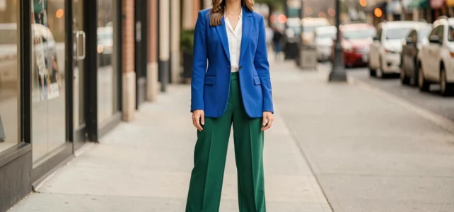
Combining three bright colors in the same outfit raises a question of dosage above all. The risk is not the color itself, but the distribution: too uniform, the whole looks like a mannequin in a shop window. Too unbalanced, one piece overshadows the other two.
The trends of 2026 confirm a shift towards more saturated palettes after several seasons dominated by chocolate, burgundy, or butter yellow. Understanding how to distribute these shades according to the material, surface, and context of use allows for creating readable outfits without sacrificing intensity.
Proximity of brightness rather than maximum contrast: what changes in 2026
The color-blocking as we knew it relied on stark oppositions. In 2026, the logic evolves: associations of shades with similar brightness create a more fluid visual balance. Specifically, a cherry red, tangerine orange, and fuchsia pink work better together than a bright red set against an emerald green and a lemon yellow.
This approach does not eliminate contrast; it shifts it. The difference lies in saturation and texture rather than position on the color wheel. An orange linen pant and a saturated pink ribbed top do not vibrate the same way, even if their brightness remains comparable.
To identify the best combinations of 3 colors, one must think in terms of brightness family before considering the color wheel. A trio of medium tones (neither pastel nor neon) offers a more wearable base than a trio mixing a pastel, a bright, and a neon.

Proportions of bright colors: the 60-30-10 rule adapted to outfits
The 60-30-10 distribution comes from interior design but translates directly to clothing. The dominant color occupies the largest area (dress, wide pants, coat). The second covers an intermediate piece (top, short jacket). The third is limited to an accessory or detail: bag, shoes, earrings.
This distribution prevents the infamous “window display look” because it establishes hierarchy. The eye identifies a main color, then discovers the other two in successive layers. Three colors of equal surface create a visual overload, even if the shades match on paper.
Adapting the proportion to the context of use
In the office, the dominant should be the dullest shade of the trio. A brick red pant worn with a coral blouse and lemon yellow mules remains readable in a semi-formal professional environment. Conversely, reversing the proportions (lemon yellow pant, coral jacket, red bag) shifts towards a weekend vibe.
In the evening, the surfaces reverse: the most saturated piece can become dominant. A fuchsia dress paired with orange accessories and a green clutch works because the context allows for this intensity. The context determines which color of the trio takes the lead role.
| Context | Dominant Color (60 %) | Secondary Color (30 %) | Accent (10 %) |
|---|---|---|---|
| Office | Dullest shade of the trio | Medium shade | Brightest shade (accessory) |
| Weekend | Medium shade | Bright shade | Complementary shade (shoes, bag) |
| Evening | Most saturated shade | Medium or metallic shade | Contrasting shade (jewelry, clutch) |
Fabrics and bright colors: why the fabric changes everything
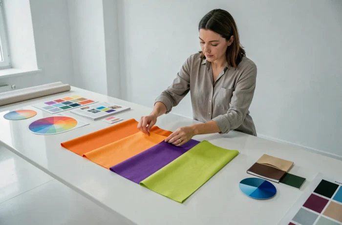
The same red does not produce the same effect on satin, cotton, or crumpled linen. Satin amplifies saturation, while linen softens it. Combining three bright colors in the same material (three pieces in smooth jersey, for example) standardizes the textures and reinforces the impression of a monolithic block.
Varying the materials breaks the monotony without adding extra color. A red cotton twill pant, an orange open-knit top, and a pink linen blazer create three distinct visual planes. The eye perceives depth, not a flat surface.
The trends of 2026 also confirm that bright colors are no longer limited to main garments. Lemon yellow or bright red are increasingly appearing on accessories (bags, mules, earrings) as a finishing touch rather than as the base of the look. This approach with colored accents simplifies the construction of a trio: two bright pieces in different materials, complemented by an accessory in a third shade.
Three tested trios of bright colors by context
Office Trio: brick red, coral, mustard yellow
The brick red on straight pants anchors the outfit. The coral on a blouse adds warmth without shouting. The mustard yellow on a belt or bag structures the look. This trio works because all three shades share a warm base.
Weekend Trio: fuchsia, tangerine orange, prairie green
The fuchsia on colorful jeans or a midi skirt sets the tone. The tangerine orange on a thick cotton t-shirt serves as a counterpoint. The prairie green on sneakers or a headband remains discreet. The key: none of the three pieces is made of shiny fabric.
Evening Trio: cobalt blue, bright pink, lemon yellow
The cobalt blue on a dress or jumpsuit serves as a foundation. The bright pink on a short jacket or shawl draws the eye. The lemon yellow on earrings or a clutch punctuates the ensemble. Here, the cobalt blue absorbs light and allows the other two colors to shine.
- Check that the three shades have comparable brightness before finalizing the trio, even if they come from different color families.
- Assign each color a clear role (dominant, secondary, accent) and stick to it, including in the choice of accessories.
- Change the material of at least one piece in the trio to avoid the flat effect: knit against cotton, linen against satin, leather against jersey.
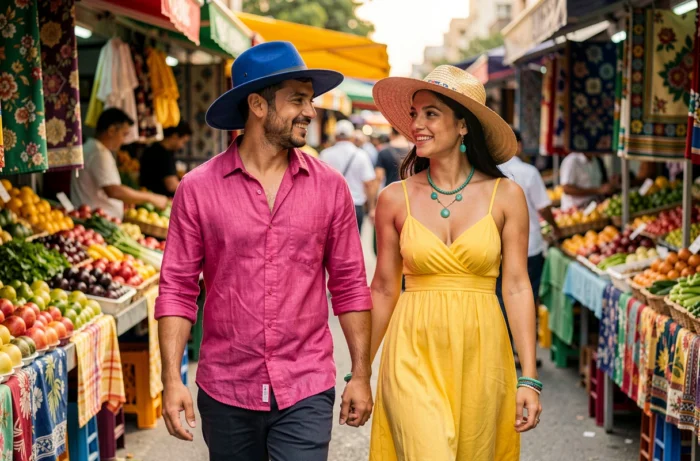
Wearing three bright colors remains a question of textile hierarchy more than color theory. The shade matters less than the surface it occupies, the material that carries it, and the context in which it appears. A well-proportioned trio on varied textures works everywhere, from the office to the evening, without ever resembling a color chart.